The 17-Point Landing Page Conversion Checklist for 2026
Most landing pages do not have a traffic problem - they have a friction problem. Visitors arrive interested and leave quietly because something small got in their way: an unclear headline, a form that asks too much, a button that does not promise anything. The fix is rarely a redesign; it is working through a disciplined checklist.
This is that checklist: seventeen points, grouped into six phases, ordered so the highest-impact fixes come first. It applies equally to paid-traffic pages, organic offer pages, and campaign landers.
Phase 1: Message Match Before Design
1. Match the ad or source promise exactly
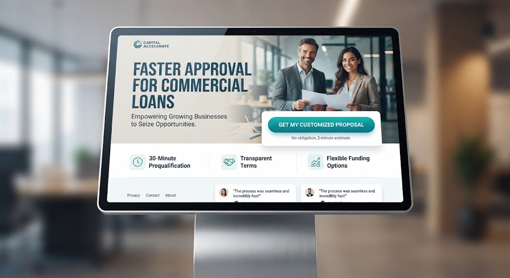
The headline a visitor just clicked must be answered by the headline they see. If your ad promises faster loan approvals, the page cannot open with generic brand messaging - visitors decide within seconds whether they landed in the right place, and mismatch reads as wrong place.
2. One audience, one outcome per page
Pages trying to speak to everyone convert no one. Build separate pages for separate campaigns rather than one multipurpose page - each with its own promise, proof, and call to action.
3. Name the outcome and the audience in the headline
"Faster approval for small-business loans" beats "Welcome to our company." Outcome plus audience in one line is the strongest headline formula on landing pages.
Phase 2: Above the Fold
4. Subheadline explains how, briefly
One sentence under the headline naming the mechanism or differentiator - not another slogan.
5. Primary CTA visible without scrolling
Contrasting color against the page, action-verb label ("Get My Free Quote," never "Submit"), and placed where the eye lands first.
6. Show proof above the fold
A customer quote with name and company, recognizable client logos, or a specific number you can stand behind. Generic "trusted by thousands" claims read as noise; specifics read as evidence.
7. Remove navigation and exit paths
No site menu, no footer links, no social icons competing with the single action. Every link off the page is a leak in the funnel you paid to fill.
Phase 3: The Form
8. Ask only for what you need
Every extra field costs conversions. Audit each field and justify it - can you get the phone number later, on the thank-you call? Default to the minimum viable ask.
9. Make fields effortless
Correct mobile keyboards (numeric for phones), inline validation that fires on blur rather than submit, and clear error messages. Friction here is invisible in analytics but fatal in practice.
10. Answer the privacy objection inline
A one-line reassurance beside the button ("We reply within one business day; no spam") removes the silent hesitation that kills form completion.
Phase 4: Trust and Objections Below the Fold
11. Handle objections as an FAQ
List the three to five doubts your sales team hears most and answer them on the page. Every unanswered objection is a visitor who leaves to think about it.
12. Stack specific trust signals below the CTA
Reviews with context, guarantees stated plainly, security badges near the form, before-and-after results. Vagueness converts nobody; specificity converts skeptics.
13. Show real outcomes, not features
Visitors buy outcomes: more bookings, faster turnaround, fewer headaches. Translate every feature claim into its customer consequence.
Phase 5: Speed and Mobile Discipline
14. Load in under two seconds
Ad-click momentum decays fast; every extra second of load time bleeds visitors before your headline even renders. Run the page through PageSpeed Insights, fix what fails, and re-test after any design change. Our page speed diagnosis playbook covers the method.
15. Design thumb-first
Most paid traffic is mobile. Buttons reachable one-handed, forms short enough to finish on a phone keyboard, click-to-call where calling is a valid conversion.
Phase 6: Measurement and Iteration
16. Track before you launch
Set up conversion tracking first: a conversion event on form submit plus a thank-you page, so every optimization decision afterward has real numbers behind it. Pages launched without tracking get "improved" by opinion.
17. Test one variable at a time
Headline, button label, form length, hero image - change one, measure against baseline, keep the winner, move to the next. Sequential single-variable testing is slower than redesigning on instinct but compounds reliably instead of churning.
What This Looks Like in Practice
A recent campaign rebuild for an e-commerce client applied this exact sequence - message match from the ads, proof above the fold, form trimmed to essentials, distractions stripped - and moved checkout-page conversion from 0.8% to 2.6% while cutting cost per acquisition roughly in half. The full numbers are in our Bright Commerce landing page case study.
That is the realistic scale of improvement when friction is removed systematically rather than redesigned decoratively.
When to Bring in Help
If you have worked the checklist and conversions still stall, the bottleneck is usually structural - offer positioning, audience-message fit, or measurement gaps that hide the real drop-off. Our landing page design service builds pages with this checklist built in from the first wireframe, and our CRO program runs the ongoing test-and-measure loop for businesses that want continuous improvement rather than one-off fixes.
The Five-Minute Message-Match Audit
Run this on any landing page you currently run traffic to:
1. Screenshot the ad or email that sends visitors here - cover the URL
2. Show both ad and page to someone who has never seen the campaign; ask what the page is selling and who it is for
3. If they hesitate or describe it differently than the ad promises, message match is your first fix
This one exercise surfaces most conversion problems faster than analytics, because analytics shows where visitors leave but not why.
Common Checklist Violations We See Most
After auditing many campaign landers, the same violations repeat:
• Headline describes the company instead of the customer outcome
• Proof claims without specifics - "trusted by businesses" with no names, numbers, or context
• Forms asking for information sales never uses
• Page speed ignored because the design looks fine in the office on desktop fiber
• Tracking added after launch, so early traffic produced no learnable data
Each violation alone is survivable; stacked together they explain pages that receive plenty of clicks and produce few conversations.
Frequently Asked Questions
How long does it take to see conversion improvements?
Fixing obvious friction - headline clarity, form length, load speed - often moves results within the first test cycle once traffic flows through. Compounding gains come from the sequential testing habit, not any single change.
How many form fields should a landing page have?
As few as the follow-up process allows - commonly three to five for lead-gen (name, email, phone where genuinely needed). Every field must justify itself; if sales never uses a field, remove it.
Should landing pages have navigation menus?
No. Navigation is the most common leak on otherwise well-built pages - visitors who wander to the homepage rarely return to convert. Keep the exit as the conversion.
How is a landing page different from a regular website page?
A landing page has one job, one audience, and one measurable action - no navigation, no competing offers, no browsing. Regular website pages serve exploration; landing pages serve conversion. Sending paid traffic to a homepage wastes the click, because homepages are built to let people leave.
Do popups ever work on landing pages?
Exit-intent recovery can work on longer pages, but interruptive popups during the first screen consistently cost more than they recover. On short landers, skip them entirely.
One Goal Per Page
Every element must support a single conversion goal. Multiple offers dilute results.