Bright Commerce Campaign
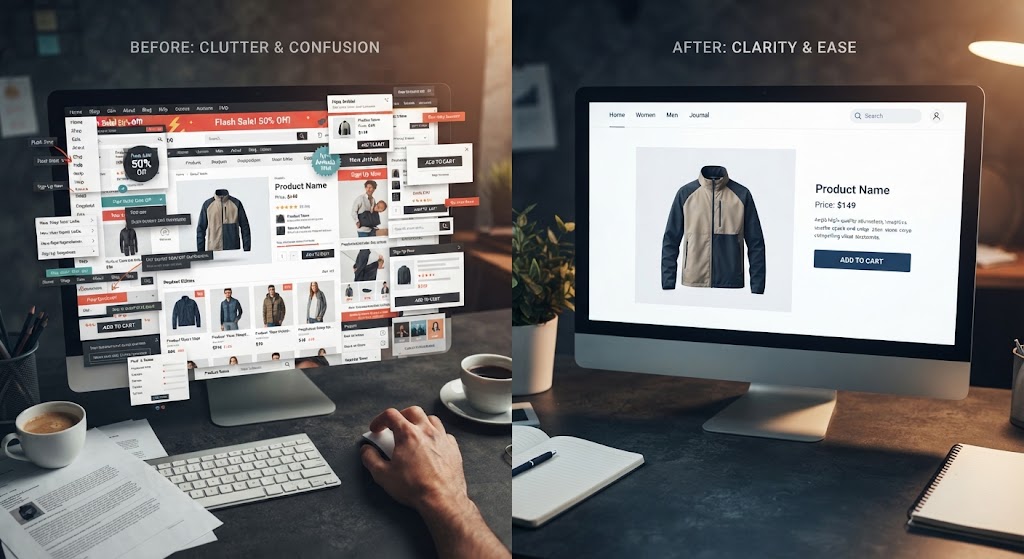
The Problem
Bright Commerce was running paid campaigns that brought plenty of clicks and almost no sales. The clicks went to a page with a hero image of a shopping bag, a paragraph of welcome copy, and a buy button competing with three other links in the header. Their conversion rate was 0.8 percent, and nobody could say exactly why people left.
The Solution
We rebuilt the campaign page around the offer instead of the company. The headline now states the deal in plain terms, the subheadline gives the one line of context a cold visitor needs, and the first screen contains exactly one call to action. We removed the navigation entirely — there is nowhere to go except the offer. The form was cut from seven fields to three, with a trust message under the button explaining what happens after submission. Proof sits where the objections form: customer count, a short testimonial, and a money-back guarantee line placed next to the submit button. The page also loads fast, under a second, because every paid click is a bill.
Technologies Used
Conversion events wired for form submission, scroll tracking, and a headline variant ready to test — built as a lightweight static page served from a CDN.
Business Impact
In the six weeks after launch, the page converted at 2.6 percent — three times the previous rate — with the same traffic. Cost per acquisition dropped by more than half, and the campaign budget that used to disappear into lost visitors now funds the testing that keeps improving the page. The template became the standard for every campaign the client runs. They then asked us to build the same structure for their other two products: the second version shipped in four days, because the pattern — promise, proof, one action, tracking — travels well once it is proven, and its conversion rate beat the original within a month.