Quantum SaaS Landing Page
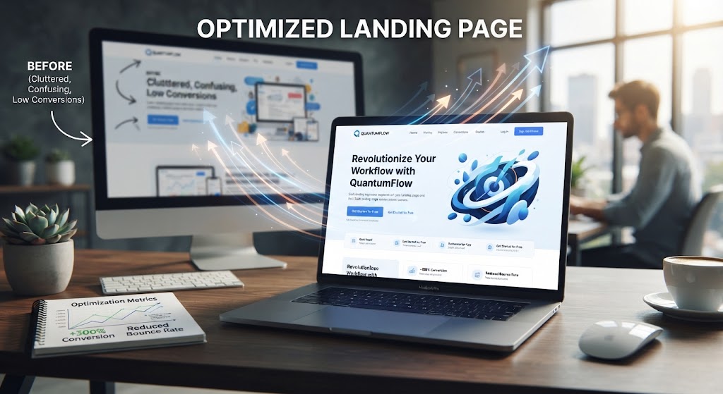
The Problem
Quantum Inc was spending a five-figure monthly budget on paid ads that pointed at a product landing page built in an afternoon. The page looked fine and said almost nothing: a vague headline, a generic form, no pricing context, no proof. Demo requests were coming in at a fraction of what the traffic should have produced, and the sales team was spending calls with prospects who had no idea what the product did.
The Solution
We rebuilt the page around one job — getting qualified prospects to book a demo. The new headline named the outcome the product delivers for its buyer, the subheadline explained how it works in two sentences, and the body answered the five questions every evaluation goes through: what it is, who it is for, what it costs, what happens next, and why now. Social proof went in where it matters: a customer quote and a usage number above the fold, and a comparison table that lets serious prospects self-qualify. The form asks for name, work email, and company size — nothing else.
Technologies Used
A lightweight static build served from a CDN that loads in under a second even on mobile data, with conversion events wired for demo requests, scroll depth, and time on page, and two headline variants set up for A/B testing.
Business Impact
In the first thirty days, demo request rate more than doubled, cost per demo dropped 31 percent, and the sales team reported that callers arrived knowing what the product does. The winning headline variant now drives the paid account, and the same template is being reused for the company's other product lines. The client also adopted the tracking setup for their other campaigns, so every landing page now reports the same way. Their ad agency confirmed the page is now the top performer in the account, and the demo pipeline has stayed consistent since launch. No redesign has been needed — the A/B tests keep improving the one that works.